Welcome to the [program] web site. This site is hosted by [our organization] and serves as a space to showcase [our work and efforts]. Please peruse the links and resources below to learn more about [topic].
Writing homepage content is hard.
You’ve spent months on the colors and structure. The 8,000 word content page three levels down has been through six reviews. The project is over budget because the developer didn’t realize all your users were on IE. Everyone is tired of the project and you want to get back to your real job.
And then, a week before launch, you realize you there’s placeholder text on the homepage.
Here’s why you shouldn’t replace it with a welcome message.
It’s not a house, it’s a conversation.
We call them homepages, which sets up an odd metaphor. When someone shows up at your front door, there’s a moment of awkwardness, even if you know them.
Hey! Welcome! Come on in.
How are you? The place looks great!
Good! Aw, thanks. It’s not usually this messy… How are you?
It’s weird, because the conversation starts from zero. Because it’s social, not transactional, there are formalities to take care of before you can get to the interesting stuff.
But when users come to your website, they’re not wandering a residential neighborhood knocking on doors and looking for new friends to spend time with. They’re trying to get somewhere, find something, or complete a task.
If someone comes up to me on the street and asks, “is 16th street that way,” I don’t reply: “Welcome to this conversation. My name is Corey, and I offer middling-level knowledge of this neighborhood and its environs. Please listen to the following words to understand what I may know about 16th street.”
And what kind of weirdo answers a simple question with a monologue?
It’s the same online. Users walk up and ask a question by getting to your website: they search (“where can I find the phone number for this store?”) or browse (“what reports does this organization offer in this topic?”) or click on a link (“I want to sign up for that event!”).
Sometimes the best welcome is a well-labeled exit.
Answer your users, instead of monologuing at them. They should be able to spot the phone number, find the reports, and get to the sign up page. Help them skim and move on.
The good news is that this is where all that other work comes in: your website structure foregrounds the major things users are looking for, your links and buttons help them complete tasks, and the few people who really are looking for that 8,000 word reference page can find it.
The bad news is we still haven’t replaced the filler content on the homepage.
Filler-zappers: What goes there instead?
1. Nothing.
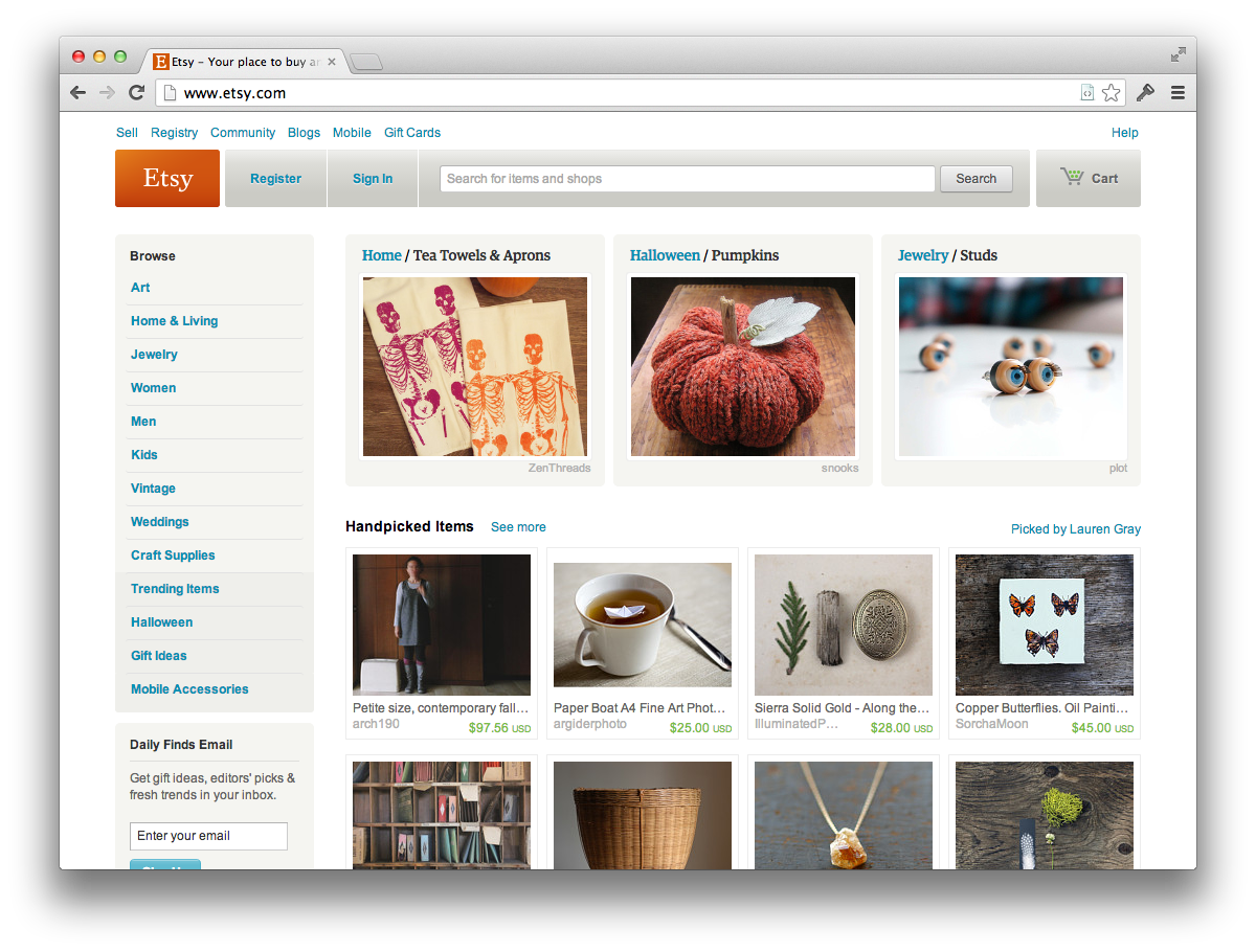
No, really. What happens if you delete that content? Does it look weird? If someone were to land on your site without a clue, would they still be able to figure out where they are? (Between the title, the navigation, the images, and whatever else is on the homepage, the answer is often yes.)
Here’s the Etsy homepage, which has no intro text at all:

2. Tell them what you do.
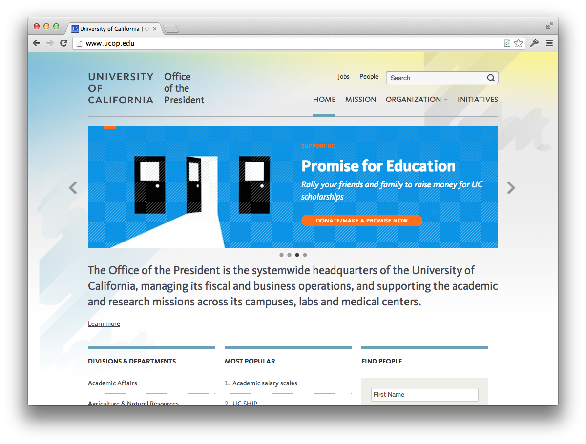
Imagine a user walking up to your website and asking, “Excuse me, what do you do? Can you help me?” Answer honestly. Use words they might recognize.
Here’s a site I worked on:

3. Say who it’s for.
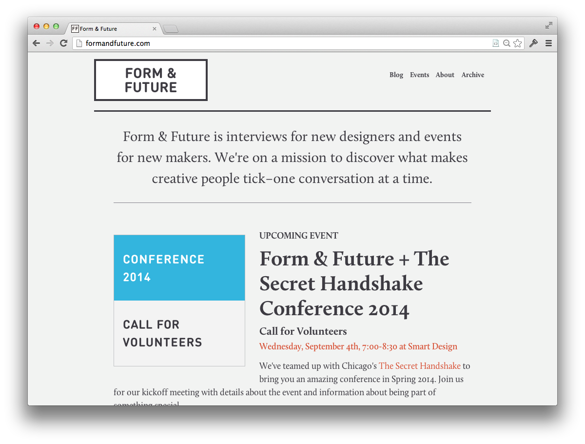
If it’s a site for experts, beginners will be frustrated. If it’s a site for a program only available to 14-18 year olds, say so — a 19-year-old would be wasting their time. Be nice, but direct. They’ll appreciate it if they can figure out quickly whether they’re in the right place.
Here’s a great example from the Form & Future site, which I was just looking at:

4. Keep your welcome.
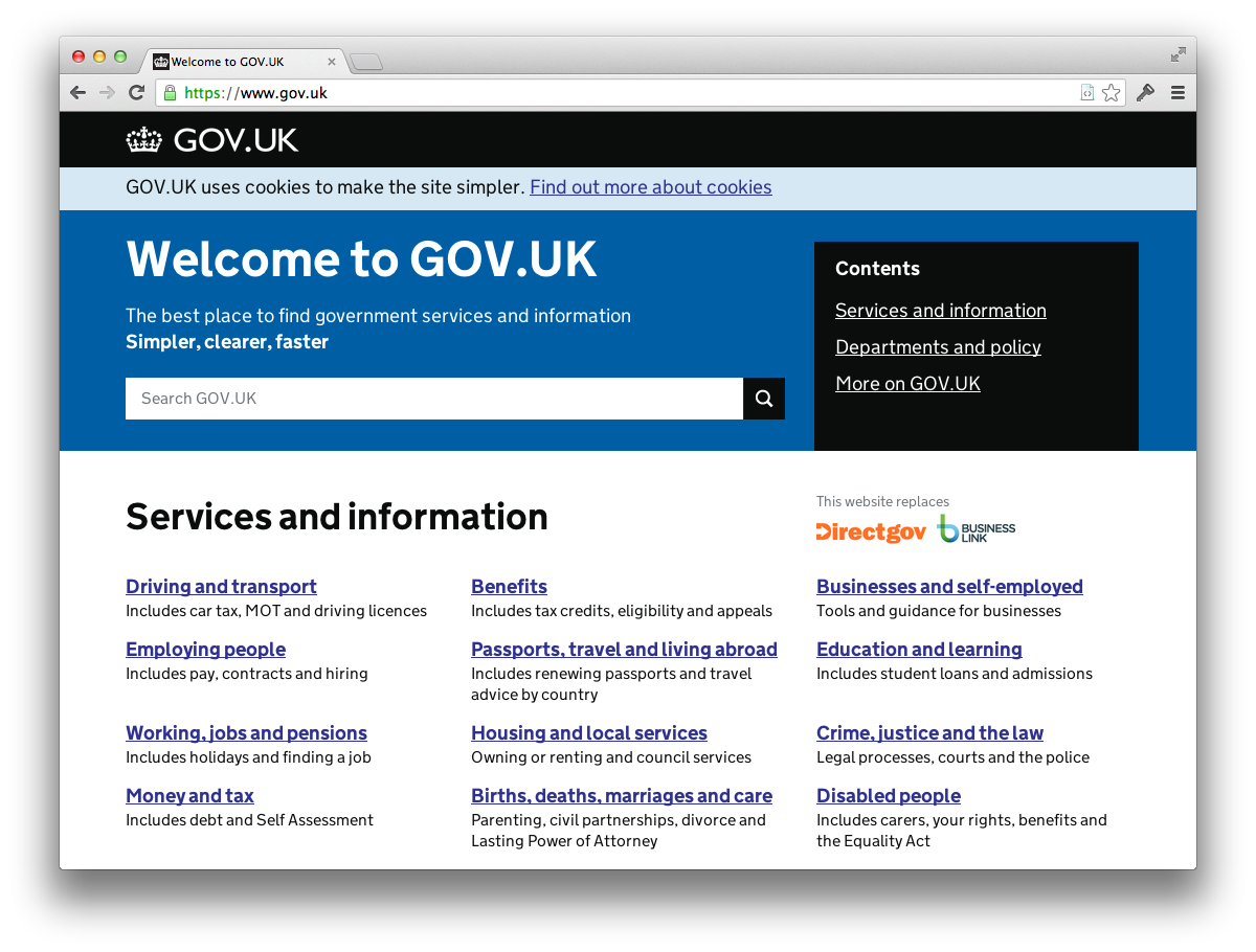
Lots of great sites have the word “welcome” on their homepage. Make it quick and move on.
Gov.uk, show us how it’s done:

As I was finishing up this post, I found — in my own bookmarks — this wonderful post from 2009 on the venerable Brain Traffic blog. It says this all much more concisely. I’m publishing this anyways, because I keep seeing sites with welcome messages. (Also, I keep thinking about @webmeadow’s Once More, with Feeling!, and I think she’s right.)